
|
Book Home Page Bloglines 1906 CelebrateStadium 2006 OfficeZealot Scobleizer TechRepublic AskWoody SpyJournal Computers Software Microsoft Windows Excel FrontPage PowerPoint Outlook Word 

Host your Web site with PureHost! 
|
 
Thursday, February 15, 2018 – Permalink – Match Format PasteCopy/Paste formatting in Word, PowerPoint or ExcelWhen you copy information from a Web page or another document, the formatting will also be copied. To match the formatting of the target document, copy the text and place the cursor where you want to insert the copy. Then, go to Edit>Paste Special, and select the Unformatted Text option. (Click the arrow under Paste in the Clipboard group on the Home tab in 2007+) The clipboard text will be pasted to match the target. Another way when using Word 2002 + is to click on the "Smart icon" that appears at the lower right corner of the pasted text. You can then choose to keep the original formatting, match the destination formatting, keep text only, or apply a new style. An additional way to transfer just the formatting between documents is to highlight the text with the formatting you wish to copy and then hold down the Ctrl key and the Shift key and press the C key (Ctrl+Shift+C). Release the keys. Select the text you want to have formatted. Hold down the Ctrl key and the Shift key and press the V key (Ctrl+Shift+V). Only the formatting is copied, not the text. In Excel use Edit>Paste Special and select the "Formats" option. What's So Special About "Paste Special"? Video Paste Special can also be used with graphics. You can change Word's default behavior; choose whether to paste Inline or Floating. Microsoft Word MVPS FAQ See all Topics excel <Doug Klippert@ 3:57 AM
Comments:
Post a Comment
Thursday, December 21, 2017 – Permalink – Chart ArtApple πLook at how different media organizations have used graphics/graphs to illustrate the news. Lee LeFever: The Art of Explanation While Edward Tufte has concerns about representing data accurately in charts, he does, use pictures to demonstrate relationships. (See Edward Tufte) If you would like to try your hand, here are some links that will help to spice up your condiment report. PC Magazine: Add Images to Excel Projects MacWorld: Excel Chart Art Andy Pope: Dividing a graphic into sections Excel 2007-13 has a great graphic look for charts, but these links still work See all Topics excel Labels: Charts, Formats, Graphics, Reference, Tips, Tutorials <Doug Klippert@ 3:34 AM
Comments:
Post a Comment
Thursday, October 26, 2017 – Permalink – Insert Line Breaks With CodeLabel CaptionsIf you've ever needed to insert line breaks in a message box prompt, you most likely built a string that incorporated a line feed or carriage return character. Unfortunately, label objects aren't as forgiving when it comes to using these characters. If you're setting a label's Caption property with code, you'll find that the special control characters are interpreted as squares, since they're otherwise un-displayable. To successfully insert a line break in a label caption, you need to include both a line feed character and a carriage return character, entered consecutively. To do so, you can use the Chr() function, such as: Me.Label1.Caption = "Line 1" & _ Chr(13) & Chr(10) & "Line 2" However, you can also simplify your code using an built-in constant: Me.Label1.Caption = "Line 1" & vbCrLf & "Line 2" See all Topics excel Labels: Formats, Functions, General, Reference, Shortcuts, Tips, Tutorials <Doug Klippert@ 3:08 AM
Comments:
Post a Comment
Wednesday, August 23, 2017 – Permalink – Location IndicatorPoint to the spotHere's a link to the code that produces conditional formatting on the fly to the cells in the current row and column.  Color banding location See all Topics excel Labels: Formats, Formulas, General, Reference, Tips, Tutorials <Doug Klippert@ 3:33 AM
Comments:
Post a Comment
Friday, August 18, 2017 – Permalink – Zeros - Before and AfterNothing's a problem"When you import data into Microsoft Access, trailing zeros may be lost. This will happen when you import data that is formatted to show these zeros, but where the zeros are not actually part of the data. How to Preserve Trailing Zeros When Importing Data Also: Word — Decimal Point or Trailing Zeros Missing When You Merge Microsoft Access Database Excel — Using a Custom Number Format to Display Leading Zeros See all Topics excel <Doug Klippert@ 3:33 AM
Comments:
Post a Comment
Monday, March 27, 2017 – Permalink – Stacked ColumnsOn on anotherInstructions how to put one column on top of another in a chart.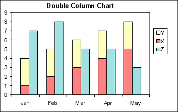 People.stfx.ca See all Topics excel Labels: Charts, Formats, General, Reference, Tips, Tutorials <Doug Klippert@ 3:15 AM
Comments:
Post a Comment
Monday, February 27, 2017 – Permalink – Positive Negative ColorsVaryChange the color when going from positive to negative.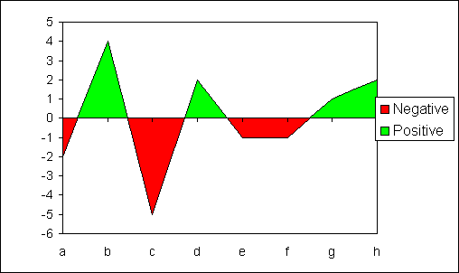 AndyPope.info See all Topics excel Labels: Charts, Customize, Formats, General, Reference, Tips, Tutorials <Doug Klippert@ 3:38 AM
Comments:
Post a Comment
Saturday, November 19, 2016 – Permalink – Sparklines 2013Hail TufteNew for Excel 2010-13See all Topics excel Labels: Charts, Formats, Formulas, General, Reference, Tips, Tutorials <Doug Klippert@ 8:22 AM
Comments:
Post a Comment
Friday, November 04, 2016 – Permalink – Conditional Formatting IIIf, thenJon Peltier offers a number of ways to format conditional charts.PeltierTech.com See all Topics excel Labels: Charts, Customize, Formats, General, Reference, Tips, Tutorials <Doug Klippert@ 3:21 AM
Comments:
Post a Comment
Thursday, September 29, 2016 – Permalink – Color ScalesConditional colorsHere is some information on Conditional color scales in Office 2010.Excel-Easy See all Topics excel Labels: Charts, Customize, Formats, General, Reference, Tips, Tutorials <Doug Klippert@ 3:29 AM
Comments:
Post a Comment
Thursday, September 01, 2016 – Permalink – Chart Null Data GapsFill in the spacesWhen creating a chart, data can sometimes be missing. You have a choice of leaving the cells empty or making them zero. By default, an empty cell will leave gaps in your graph. Zero entries will send a line graph down to the base line. One way to force Excel to interpolate the data is to enter the function =NA() in the empty cells. Another way is to go to Tools>Options and choose the Chart tab. Pick how you want data plotted - with gaps, as zero, or interpolated.  Microsoft also has this suggestion: Gaps between the dates "If the datasheet data for the category axis contains date number formatting, Microsoft Graph automatically uses a special type of axis in your chart called a time-scale axis. Note, For 2007+, on the Design tab, click Select Data in the Data area, and then click Hidden and Empty Cells on the Select Data dialog box. See all Topics excel Labels: Charts, Formats, General, Reference, Tips, Tutorials <Doug Klippert@ 3:06 AM
Comments:
Post a Comment
Tuesday, August 02, 2016 – Permalink – Conditional FormattingMuch more capabilitiesPre-2007 Excel was limited to only 3 conditions. The new Office is more generous and versatile. Here are some of the features:
2007+ Conditional Formatting See all Topics excel Labels: Formats, General, Reference, Shortcuts, Tips, Tutorials <Doug Klippert@ 3:24 AM
Comments:
Post a Comment
Sunday, June 26, 2016 – Permalink – Shortcut BordersKeyboard trickUse Ctrl+1 (on the top row of number keys) to bring up Excels Formatting dialog box. Shift+B will take you to the Borders tab. Now you can use the following key strokes (2002+):
 Shortcuts for Applying Borders Ctrl+Shift+7 will outline a cell without having to display the Format dialog. See all Topics excel Labels: Formats, General, Reference, Shortcuts, Tips, Tutorials <Doug Klippert@ 3:35 AM
Comments:
Post a Comment
Thursday, April 07, 2016 – Permalink – Plain NumbersI'd Like to Make It ClearPlain Figures is a method of transforming statistical and financial data into figures, tables and graphs that people readily understand. Have you ever:
PlainFigures.com See all Topics excel <Doug Klippert@ 3:16 AM
Comments:
Post a Comment
Tuesday, March 29, 2016 – Permalink – Thirtieth Condition FormattingThree is not always enoughPre-2007 Excel gives the user the ability to specify up to three conditions under Format>Conditional Formatting. If that is not enough, here's the code that extends the conditions to 30!  Extended Conditional Formatter Also see: Conditional Formatting (including 2007) See all Topics excel Labels: Customize, Formats, Formulas, General, Reference, Shortcuts, Tips, Tutorials, VBA <Doug Klippert@ 3:09 AM
Comments:
Post a Comment
Friday, December 11, 2015 – Permalink – Hide DigetsSimple obfuscationThe kid said, "Daddy, I know the secret password! It's star, star, star, star!" **** You can use functions to hide parts of sensitive data. Social Security Number 555-55-5555 =CONCATENATE("***-**-", RIGHT(B2,4)) Combines the last four digits of the SSN with the "***-**-" text string (***-**-5555)  Credit Card Number 5555-5555-5555-5555 =CONCATENATE(REPT("****-",3), RIGHT(B3,4)) Repeats the "****-" text string three times and combines the result with the last four digits of the credit card number (****-****-****-5555) Microsoft Office Online: Display only the last four digits of identification numbers See all Topics excel <Doug Klippert@ 3:01 AM
Comments:
Post a Comment
Sunday, November 01, 2015 – Permalink – Spreadsheet DesignMake it work and look goodTimothy Miller uses the nom de screen of "Jethro" (Moses' Father-in-Law). His SpyJournal.biz site/blog gives some tips on how to present an Excel solution
You'll find the complete text here: Design Presentation Tips Also see: The Art of the Spreadsheet See all Topics excel Labels: Customize, Formats, General, Reference, Tips, Tutorials <Doug Klippert@ 3:45 AM
Comments:
Post a Comment
Monday, October 05, 2015 – Permalink – Format NumbersIt's your choiceOzGrid: Custom Formats If you need to format numbers that will be displayed connected to text, here is one way to do it:
Excel Tips Formatting concatenated numbers and text Or:  Also: Excel Format Tips Also: A very well produced examination of the subject by Jon Peltier: Number Formats in Microsoft Excel See all Topics excel <Doug Klippert@ 3:55 AM
Comments:
Post a Comment
Friday, September 25, 2015 – Permalink – Time Without LimitsNo DelimitersExcel is most happy when you enter dates and times with the correct separators. 1/1/2004 is a good date. So is 1-1-2004. If you just entered 112004 in a cell formatted as a date you'll get: Wednesday, August 27, 2206 the 112,004th day since January 1, 1900. Chip Pearson has come up with VBA code, using the Worksheet_Change event procedure, that will allow you to enter dates without dashes or slashes.  See: Date And Time Entry See all Topics excel Labels: Formats, Functions, Macros, Reference, Shortcuts, Tips, Tutorials, VBA <Doug Klippert@ 3:55 AM
Comments:
Post a Comment
Sunday, August 30, 2015 – Permalink – Too Many SlicesMore data than the pie will holdA pie chart displays the per cent of the whole is represented by the component elements. Four salesmen, four slices of pie. The problem arises when there are 10 or so components that vary in size. The labels begin to overlap and the chart is difficult to read:  One suggestion that Chris Weber offers is to rearrange the order of the slices:  The article uses MS Graph in Access, but the techniques are applicable in all the other applications that can use graphs. SmartAccess: Easy as Pie. . . "Chris Weber provides you with a generic method to control the data for pie charts that are actually readable." (A downloadable example file is also provided See all Topics excel Labels: Charts, Formats, General, Reference, Tips, Tutorials <Doug Klippert@ 3:49 AM
Comments:
Post a Comment
|
